Air and KDE 4.3.
Air was the wallpaper we introduced in KDE 4.2, but that is just the beginning of something larger. Air is supposed to be different than what Oxygen is, something that tries to appeal to a user base looking for a more "sexy" experience than Oxygen (yeah I know you are out there :) ), but to still have the capability of merging nicely with what we have now. The first thing we started working on was a Plasma theme. Plasma, with it's immense plasticity and a fantastic coder team, allows us to try to push for new ideas. Another extremely cool thing about Plasma is it's ability to become anything you want it to be. So a user in KDE 4.3 might have a desktop that looks like this, if that is his wish, without having to use external software: (click for fullscreen mode) This is an example of how simple one can make a desktop in the 4.3 Plasma once we all manage to get all of our plans working. The new systray speck will help, the work being done on the task bar will allow you ...


Comments
A bit more yellow or orange flames please :-)
Anyway, guess better a copycat than having some crappy icon.
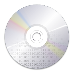
Your version is better actually... flames are red and the cd is more relevant to the application's purpose. Keep up the good work! (maybe get rid of some of the small flame tongues?)
EN:
You should be paid for this! It's absolutely amazing!!!
I like it the way it is now
Some questions...
Is this icon supposed to be a substitute of the one oxygen has now?
Will there be icons for all those actions on k3b too?
(For instance: New data project, copy medium.. etc)
K3b is themable. Will there be an Oxygen (or air) theme for k3b too?
Man, you are the best... I agree with Tiago...
Definitivamente tu TENS que ser pago... teu trabalho é maravilhoso. Parabéns
We owe you a lot for making KDE the most sexy desktop in the world :)
perhaps if we get 300 dpi screens in 20 years...
I mean, at first they seemed to me (the first on the left, the bigger) a bunch of red, curved blades coming out from under the CD...
Another thing... why do flames have shadows?!
To be honest it doesn't look to me like it's something to burn CDs :( Sorry.
Otherwise very good
PS: damn tens mesmo jeito pra coisa!
http://itmages.ru/picture.php?type=view&id=4025&key=8f3eac
I think a CD plus flames is the right way to go, even though it's hardly original, since the "burning" terminology is so deeply ingrained that CD + flames = CD writer app in people's minds.
@Pinheiro: Don't get me wrong, I love your stuff and really enjoy the images you come up with. But this isn't an original idea. The left side is structurally the same so close in fact I have trouble believing it was an unfortunate coincidence. It's similar enough that you were at least inspired by it.
hate wen this happends :( .