Posts

Showing posts from November 7, 2010

This post's are getting boring no?

Image
I come here I do a "dent" like post were I show something I have done, and the progress of the work, get some feedback, and we move on.... So in order to not brake the cycle I'm forced to show a couple of icons, here they are :) Then I will make some comments on them like "this are 64x64 icons" Dohhh :) Next I will say something like .... "made 95 of this icons". And in the end leave a positive remark about the future "tomorrow I hope to do 50 more". This would conclude my post. I'm booooooring :D. P.S. Its great fun to do the work and show its progress here, but I noticed that my last posts were kinda similar, sorry about that.... We are working on many different things for the 4.6 release. And I'm confident it will be our best one ever. P.S.2 see I have done it again, ending the post with a positive line about the future. I'm really boring. :D take care
Just like before!

Image
Just like some days ago, I finished another set of mime-types now in size 128x128, and have already started with the 64x64 size, as you could see in the previous post... so 240 icons done 240 icons to go :) I'm sure there are all sorts of little and big errors in them and wen I'm done with the lot I will try to fix them.. Have fun!

Someone asked?

Image
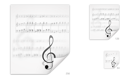
"Anonymous said... 6:00 PM I’m not sure whether this is the right place for this, but may I request a mimetype icon for Lilypond? It’s a music sheet engraving program very similar to LaTeX (www.lilypond.org)." Well no, its not the best place to ask for icons, the best place would be in oxygen's SVN playground were we keep a series of lists of required icons. But in this case and since the icon was already made I decided to show what we had done to it :) Hope you like it (I know I liked it since it was the first time I did decorative typography) I'm not unhappy how the clave looks .... 128x128 is a bit cluttered.... but well "this" icon thing is fastly becoming the art of what we can do in less time possible to as many icons you can . With time it will get better. :) PS the over contrast is a result of a quick montage in inkscape that resulted in sup pixel problems that I solved in gimp but ended up looking to sharp the real ones in svn look better...

A couple of days!

Image
A couple of days, well the last 2 at least I think have been the most productive of my life, yesterday I committed way over 100 128x128 mimetipes in to svn (only 75 missing) , also today I mostly finished a concept for a KDE website, and I am now working in kolab.org refreshed identity, that I think as some good potential.... we will see.... as usual the snapshot of yesterdays work... Crazy as it may be, I love it, KDE is a product of LOVE, the love of many many crazy wonderful people. And thankfully there are a couple of days wen everything just works (TM) . Have fun!