2 wallpapers for fun!
So after working for the past days only on icons today I decided to post 2 wallpapers cause there is more to oxygen than icons, much more....
So here they go....
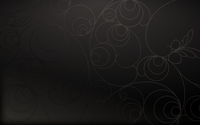
 The first one is a wallpaper I worked wen trying to come up with ideas for the media desktop activity in plasma. Works pretty well for media content. 1600x1200

The second one is a colored version of air in more pastel/green tones I can make it in pretty much any color you might want so.... yeah just need to ask.
Hope you guys like it.
P.S. the feedback from last blog post about the ecosystem gave me a lot of ideas that I will probably make a poll for the best ones just after the current poll is dead. so 2 days for cliking those links in the side.
So here they go....
 The first one is a wallpaper I worked wen trying to come up with ideas for the media desktop activity in plasma. Works pretty well for media content. 1600x1200
The second one is a colored version of air in more pastel/green tones I can make it in pretty much any color you might want so.... yeah just need to ask.
Hope you guys like it.
P.S. the feedback from last blog post about the ecosystem gave me a lot of ideas that I will probably make a poll for the best ones just after the current poll is dead. so 2 days for cliking those links in the side.


Comments
The first one looks like my laptop's case decoration =)
cheers!
See, the contrast transition between the darker lines on the bottom-left portion to the lighter lines on the top-right portion is pretty close to what I see when I look at an LCD screen (typically laptop) from the wrong angle.
As a result, it reflexively want to move to get the better angle... but I can't. Hence the eye-watering... A pity, it looked nice in the scaled-down version, where I hadn't noticed the darker lines.
I wonder how it would be without the contrast switch: have the light lines fade to background instead of becoming darker.
The first wallpaper can be great, I agree with you about to improve the lines...
The second wallpaper is spectacular...
gp
That's the problem with dark gray gradient.
Then everybody gets their own color, no work :-)
And it's a neat feature ;-)
gp
Thanks a lot in advance :)
also the 1600x1200 http://nuno-icons.com/images/wall/newair1600.jpg
enjoy and have fun
Anyway, thanks :)
PD.my english is still poor :D
I am confident that you can blow away OS X. It will not happen overnight but it will. That's thre power of teamwork!
Keep up the powerful work guy and show the world why KDE is the best DE ever!
Lovely work. Unfortunately they look horrible on the sucky LCD monitors at work. But I'm sure they look great at home so I don't care :D
In the airy one with dots, it looks the gradients are smooth and are a bit chunky. Or is it just the jpeg save quality? Is it just me?
I believe all wallpapers like this sort should be saved in PNG. The first one is already in PNG but it seems to have color banding.
the second.... yeah a png would be beter but I suplied the svg source so ;)
Nice job by the way. I wish I had some of your talent. What software do you use for these wallpapers?
~nothingCanDescribeThanThat.