Posts

Showing posts from 2008

The air we breathe

Image
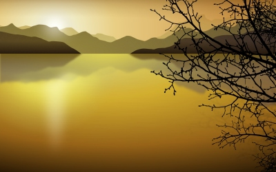
Christmas time is coming, and traditionally I do a KDE xmas wallpaper to capture the season on the KDE fashion, but this year Wade done a fantastic job, in creating stuning artwork, that makes no sense in trying to compete. Instead we decided to commit the new default wallpaper for KDE 4.2 into svn for every one out there using trunk... MERRY CHRISTMAS.

Hallo aus Frankfurt!

Image
If some one asks me what KDE is all about? I have a really hard time explaining what is a desktop and all of that... For me its more about the social experience of working in it, the creation process, and meeting the people that make this wonderful community. This weekend I have the pleasure of working directly with some of our most brilliant marketing people so the 42 release gets al the media attention it deserves. As always KDE people are sooooo nice it makes me very very happy to be involved in it.

KDE 4.2 Rocks! I told you so.

Image
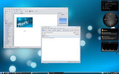
Well the last few weeks I have been able to build trunk in my machines, and I have to say that KDE is looking great. I'm not afraid to show my kde 4.2 next to a Leopard or a Vista. Of course its not as polished as a leopard, but it has its how strong selling points, or not as ... don't know how to compare it with Vista (I personally find Vista, humm... bad) The funny thing is that, it is exactly how I thought this was going to go. And I had this clear notion more than 2 years ago, wen we were fighting to get 4.0 out. At the time I thought that 4.0, I would not be able to use, (I wasn't well cause my distro did not made a version of it, and I was not brave enough to build it myself :) ), 4.1 would be usable and already better in some way than my beloved 3.5, (and it is, I use it all the time and cant get back to 3.5), and 4.2 would be on pair with the competition better in some ways, worst in others, And from my test so far its exactly so, its an amazing desktop very polis

The power of team work

Image
Some months ago when the #kwin Channel was created I decided to stop by and ask the wonderful people there about some weird ideas I had about shadows and fixing the bad windec corners on Oxygen. Luckily Lucas Murray had the patience to listen to me and actually something was started. Basically we can now provide custom shadows for kwin and that includes active shadow and inactive shadow. The big bonus we got was that we can now ship shadows that include our corners without the aliasing problems. Casper Boemann endured me all weekend long moaning about pixels so we could get this results... I Must say I'm extremely happy with the results it seemed like something impossible to get just a a few months ago. On another front we managed to get rid of the not so pretty scrollbars we had thanks to the fantastic and amazingly fast work of Huynh Huu Long. This is the result... . Its a fantastic experience working with such a wonderful group of people that can get toguether and produce

A planet filled with people

Image
Well the new planet KDE is up and yesterday we committed the last most obvious bug fixes. Major thank you, to Riccardo, Jonathan Ridell, Luke Parry, Wade, Felipe, and everyone else that helped create the new planet. What is your opinion on its look? does it look "KDE" enough ? Is it usable enough? does it represent the peoples personal view on KDE ? Or does it all look the same?

What Money Can't Buy!

Image
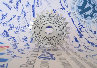
I started playing around KDE so many years ago I can't even remember. Well I can't wen but I do remember the how. How I felt, wen using something that made a revolution inside my head. And the revolution was not because it was a great piece of software, or because of the wonderful graphics, but couse of the instant feeling I had that this software was made by people, not a corporation but real people! The fundamental Idea that common people one crumb at the time can and make a difference, is something that I never forgot. Over the yeras I got to know and admire some of those people, the timed passed and I started to help what little crumbs I could to this wonderful cake KDE is. But today I got the Icing on my KDE cake, the mail brought me the KDE Akademy award along with something that that made my day (scratch that) made my year, a Document signed by many of those people I admire for so many years. To this I SAY THANK YOU, a big THANK YOU KDE!

The weather is HOT!

Image
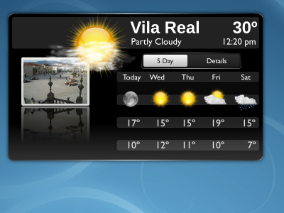
Well it is! according to the weather site its 30 cº but i think ts much more. But you might ask how come I'm talking about the weather??? Simple, I have been working on the weather plasmoid with Shawn Starr, Leeo, Marco Martin is implementing the slider/tab with some really nice animations. And we might have some action going on with the Wikipedia people to provide the pictures for each city. So we have a lot of people working on this its great :P. One major part of this is is making about 40 weather icons that we need to do any way cause 11 weather icons are part of the freedesktop.org naming speck, so a small preview of what we have so far... Still a lot of room for improvement obviously.

Some times, all you need is peace.

Image
Wen you work on something very visible, on a extremely popular project as KDE is you get a lot of unfriendly comments, about your effort, and the thing that hurts the most other than the comment being rather effortless to get the full extent of the problem, is the lack of support one gets from the peers. Very often oxygen was a victim of this problem, sometimes there was an actual problem some times there was not, and there are still many many problems. But the thing we always could count on was the support from our peers, like Aaron, he many times as supported us, trusted us, and did that effort to say, "there are problems we are here to fix those problems". Rome was not build in a day, nor was it ever the perfect city for every one, it was the joint effort of many people creating something new every day. So this time is the time to say, We SUPPORT you Aaron, Plasma is one of the most vibrant and dynamic groups I have the pleasure to work with, and its all cause of you, w

And now for somthing entirely,...... bubblishous.

Image
Seams some people don't like me doing bubbles! So I will admit i might have a problem here some sort of bubble syndrome. Any way the image. and the source svg just 8,8 Kb, I love svg. Took inspiration to do this svg from the amazing picture took by www.johnkimbler.com

Candy comes in many colors....

Image
So its just one question, Do you think this works as an wallpaper? And if so in which color?

The shape of things to come

Image
Probably by now most people have probably seen Marco Martin wonderful work on the new 4.1 theme I started on Tokamak in Milan. Apart from the trivial artwork, it provides new theming possibility's into plasma. Like for example now clock pointers can have shadows ;). So whats next? 4.2 Obviously! I plan to spend allot more time working in plasma in the 4.2 series. And we have already started to work on those things we can improve :) This is just a first approach to some of the new concepts plasma introduces. But this is all for the 4.2, for 4.1 there is still alot of work to be done before the artwork freeze so need to get back to it. ;)

The voodoo that we do.

Image
Thomas Mönicke and myself have been working on a new version of our akonadi logo. After some talks we decided to do something more in the lines of the logo Thomas made. It took quite some time to get it like I wanted and a lot of pencil and blender sketching. But after one week rambling with it I think we got it. Updated version with all the artwork! I hope you guys like I do :) DIGG

Black fan number 1.

Image
I promised to Urs Wolfer, several months ago to work with him on a new KDM theme that matched the work we were doing a bit all over. To do the KDM theme I needed a new wallpaper. Here it is in 2 versions. This one works beter as an walppaper IMO. This one is being used for the KDM. Any way the Svg link. Hope you will like it. Now i need to think about a new logo for a cool project. Wish me luck :)

I'm Active

Image
From my last blog eatery and a lot of user feedback talking to several people I arrived to a new proposal. Notice that I'm not using shadows or anything like that and the active window is in the back. What have I done? Increased the contrast of the double outline for the active window. Removed part of a gradient on inactive and placed a new darker gradient on inactive, also made the butons in outline mode in inactive. Click on image for context. So give me your opinions on this subject and if I'm in the right path or not. On a side note I decided to enter the akonadi logo contest with this entry, the 2D Monochrome Version looks a lot like Nvidia logo so i will have to remake it :P (Miss that some how).

Something entirely different in Milan

Image
Arrived from Milan quite tired, and still had to pick up my monitor from the store that went dead. So wen i finally arrived Home I just had the strength to get to bed and catch up on my sleep. So only today I find the time and the monitor to get back to work, Milan was a lot of fun, amazing people Riccardo did an excellent job, setting the meting and the space, and I'm very happy with the talks we manged to have with the plasma developers, bringing the gap between coders and "people that do pretty pictures" down a lot. I also managed to start working on a new plasma theme that brings oxygen and plasma together, but without losing identity and difference, something different that looks part of complete experience (I'm very happy with the look) .It will also marks the start of truly complete themes, that really theme other plasmids. (this will be a lot of work BTW). Well in the process of working i also managed to work a bit with Andre on the twiter plasmoid, th

Active VS inactive part II

Image
Need some feed back on some variations I been working on oxygen windeco. click on the image for a more contextual image. Right now my favorites are 3 (little changes from how it looks now) and 4 ( flat background and inverted line) 2 (no RGB chages) might be interesting but I'm not sure it will work on most color variation also kills a bit the one slab look. 5 is really simply but removes the buttons not sure its good idea 1 ..... I simply don't like (not sure what it is doing there :) ) Also made some modifications to active state extra shine on top more contrast in dividing line and color on the buttons symbols. Opinions, flames, etc wellcome

The active non active problem?

Image
Well one of the configuration options in kwin for the longest time was color... I know that i have know that for the longest time it made sense for the longest, time and i gess it still does . But oxygen started with a new idea a all in one look a unified look, and that poses a problem how does one set an active from an inactive window apart. After some work it was decided that this was enough.... Now some users think we should color the windeco. Well In all true honesty I cant see how I can do that, and still be coherent with the style, its an ok option but its not oxygen. The first time I saw oxygen style was wen Kenneth made a rendering for me of a ceramic slab with rounded corners, that is the ground basis of oxygen, as a mater of fact I'm willing to change most of oxygen except that cause its the foundation of oxygen. What I'm going to redo is the windeco buttons and had a bit of color to them so that will help as well in setting them apart. Any way what is your opini

Raptor-Menu on the move.

It is with great pride and joy that I announce the Raptor-menu site most of the documentation is already there made by Nathanael Dracor. the site implementation was made by Luke Parry, and Siraj made a nice Download page so you can test it in its current shape. Raptor-Menu does not try to be the final answer to the menu question, instead aspires to be the best answer we can give, merging many ideas form modern desktop launch menus. http://raptor-menu.org/

Nepomuk. Today a logo tomorow the..........Site :)

Image
Full color version and monochrome version of the brand new version of the NEPOMUK logo.

A brand new logo!

Image
Just some of the work we been doing latly. Its still on outline mode much like some other projects im involved with.... Time does wonders for outline rendering ;). More info in the comings days about this and alot more stuf.... :)

Its out!

Image
KDE 4.0 was just released today, Congrats to us all :) (400 pixel banner version here for people with small blog's :P) Next on my to do list: Making Planet kde restyle work. Dot kde restyle. (ideas more than welcome, ongoing brainstorm going on on #oxygen). Make the Raptor-menu. org site..... Start finishing the Scribus icon set. Begin of the open-office/koffice icon set This should keep us busy for the next month or so :).

Two Years, Six Months and a couple of days ago...

Image
Oxygen was created, well officially for me it was :). The first members were at the time was Me, David Vignony ,and Kenneth Wimer. It was set with, (what we thought at the time) an ambitious task, create a new icon theme for the upcoming KDE 4. With time the first icons were created and step by step an icon theme was born. But we did not liked it much and we redid it. and then redid it again, and again, and then we thought it was a god time to show the world our work and we did it all over again. From the initial set of icons i think none remains the same. Opening our project to the world brought new challenges. And we started doing more KDE related artwork like the web pages. and then We started wondering if we could try to do a widget theme for KDE. and so did we:) And a cursor theme, and a sound theme and a new entire look for kde 4.0, and new ideas on how to interact with the desktop. And icons for applications that are not even on KDE. And this and that. And like the icons them