Someone asked?

"Anonymous said...

I’m not sure whether this is the right place for this, but may I request a mimetype icon for Lilypond? It’s a music sheet engraving program very similar to LaTeX (www.lilypond.org)."


Well no, its not the best place to ask for icons, the best place would be in oxygen's SVN playground were we keep a series of lists of required icons.

But in this case and since the icon was already made I decided to show what we had done to it :)
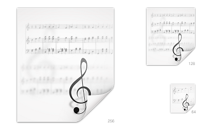

Hope you like it (I know I liked it since it was the first time I did decorative typography) I'm not unhappy how the clave looks .... 128x128 is a bit cluttered.... but well "this" icon thing is fastly becoming the art of what we can do in less time possible to as many icons you can . With time it will get better. :)

PS the over contrast is a result of a quick montage in inkscape that resulted in sup pixel problems that I solved in gimp but ended up looking to sharp the real ones in svn look better...

Comments

Unknown said…
Nice. For smaller sizes, I would enlarge the clef a little more so that the clef is the clear visual element that distinguishes the icon from other mime types on first sight.

BTW, I'm a current LilyPond developer and former KDE developer (and of course still KDE user).
Unknown said…
Here is one I once created:

lilykde.googlecode.com/svn/trunk/lilypond-kde4/icons/oxygen/text-x-lilypond.svgz

But I like yours better :-)

BTW I'm Frescobaldi's main author.
Pinheiro said…
@reinhold if you take notice I'm already doing that. and each size need to be and made, thats what makes icon making a pain :)
@Wilbert your icon was great and I was tempted to use its instead of the clave, but because i wanted to test my typography skills I ended up making a traditional sol-clave.

@reinhold and Wilbert you do great work congrats :)
toddrme2178 said…
What if, in the 128 version, if you had the bled-through ink only go across the left half the icon, instead of the whole thing? I also might get rid of the bled-through clef in the 128 version.
Vladislav said…
beautiful +2
Anonymous said…
The clef is a little too thin for my taste, but overall it's a superb icon
Anonymous said…
I think two music staffs would be better than 3 and it would be nice if the notes actually were a song.
Anonymous said…
Wohoo, thanks for this quick reaction, I asked. :-)
Indeed, the clef is a little thin. I just looked at a 'ponded document and the clef in there is quite heavy in comparison. I can't wait to see the 32 and 16 pixels version though, I barely even use anything bigger.
Pinheiro said…
@Anonymous im still working on 64x64 next will be 48x48.... but I do every icon size diferently... so I hope I will make you happy :)

Popular posts from this blog

Raptor! join the fun.

I have a question!

Air and KDE 4.3.