Quassel because we all love IRC
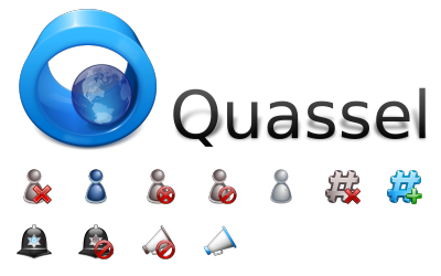
I was cheking and it as passed quite some time since I posted a blog entry about Icons, but icons are still a major part of what oxygen is... So here it goes an entry about icons: Quassel Icons.
This are the ones we did so far, and they are a bit more joyfull than the typical oxygen icon but ,I think that IRC and IM applications are more Social and fun applications, so we tried to do them a bit more up and fun... BTW Quassel people rocks.
While doing this we needed to do some IM like users and that started a new type of user for this kind of apps. Think it looks pretty.

Yeah I know the light one that is suposed to stand for invisible is not working very well... I will work more on it...
PS The problem with the transparent Icon is already solved, thanks to Jpsetso ;) http://tinyurl.com/bchodb


Comments
The icons are pretty cool, but i'm not fond of the msn like dude.
Hope Kopete will get some love because it's one of the most ugly apps of KDE4 in terms of usability/design.
Quassel is popular because konversation couldn't keep up with the damn times. A KDE4 environment should only ship with new backend stuff, like whatever qt is beeing used and drop the old things due to memory limits on cd etc, optimization and better integration.
If you want to stick with konversation, it's fine, but quassel will 'get there'.
The attention to detail is crazy. So simple at a first glance, but they're nearly flawless. I can't imagine how much time this took you.