The air we breathe
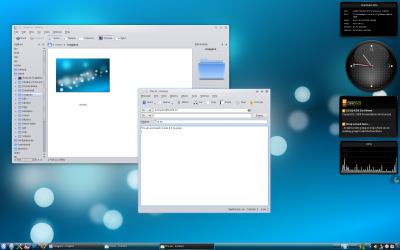
Christmas time is coming, and traditionally I do a KDE xmas wallpaper to capture the season on the KDE fashion, but this year Wade done a fantastic job, in creating stuning artwork, that makes no sense in trying to compete.
Instead we decided to commit the new default wallpaper for KDE 4.2 into svn for every one out there using trunk... MERRY CHRISTMAS.

Instead we decided to commit the new default wallpaper for KDE 4.2 into svn for every one out there using trunk... MERRY CHRISTMAS.


Comments
The panel background is a little too vista-ish, and I'm not a fan of the solid black line that creates a very hard border between the panel and the desktop. Other than this, I do like the overall look and feel.
Would you mind telling which drivers you use and how well do KDE4 effects work with them?
Cheers!
P.S. You could also add the info to:
http://techbase.kde.org/Projects/KWin/HW
Have a merry christmas everyone!
You just made my day brighter! :D
I'm also using the open source 'radeon' driver and can barely wait for KDE 4.2.0 to come out and finally try it!!
When looking at the techbase.kde.org I felt like no-one cared about the open source drivers, as everybody seems to use the closed 'fglrx' ...but now you gave me back hope! :D
...now if only 3D was better supported in the 'xf86-video-ati' (i.e. 'radeon') drivers, so I could run PlaneShift, I'd be ultra-happy :]
The theme you're using is indeed great. What's its name?
Having removed the hideous "blue lines" in the windows decorations makes them way more elegant. And this new taskbar arrow for un/hiding is just perfect. Discreet and efficient, exactly as it should be.
Now, we just need to get rid of those awful "back/forward" arrows that stand out like a sore thumb in this lovely desktop, and that will be perfect!
Hats off!
a decent font (hint:see mac) would make this look much more awsome !
Just one thing that disturbs me on this new Oxygen theme, why the selected task doesn't have any level of transparency like the other parts of the panel? Is it a bug?
thanks for the great artwork, i'm your fan man
Awesome artwork.
You said "I use the open source one, and i force kwin to accept it"
Please, how do you force kwin to accept it? I use the same driver and can't get kwin to enable compositing (using trunk).
Thanks
O teu trabalho é excelente! Continua no bom caminho! :)
@ Voices yes I use mandriva but this complied kde from sources using the greas kdesvn-build script... Nut you can try kubunto neon builds or opensuse... not quite sure.... Any way 4.2 is almost done and you will be able to garb bimary for most modern distros...
How to get it to look like that??? simple use kde defoults, the only thing thta I have that is not defoult is the removal of the active window strpes(there is a ui for that). Prety much everything else is defoult...
I thikied about compile myself kde but my system is stable and dot want to mess too much :p
I hope I expressed myself correctly.
Regards,
Diego
Th general idea was to make the gradient mostly unotaceble, they are quite strong dough but aparently non existent...
http://websvn.kde.org/trunk/KDE/kdebase/workspace/wallpapers/Air/contents/images/
is this image the officil wallpaper for KDE 4.2?
maybe it's clear for all, but not for me.
(Sorry by my poor english)
Who cares, as long as it looks nice, I really like the panel. I hope they wont change it just because a moron like you compares it to Vista.
Fuck off.
Keep up the great work Nuno, I would love to see this wallpaper as the default in 4.2.
No, it's not a bug, it means that the window is ACTIVE, and we like it this way.
Don't make everything transparent because you just can, make it nice, and this way is nice.
But, a question: why don't parse the normal kde wallpaper dir structure from ~/.kde4/share/wallpapers ? For example, i svn exported this wallpaper here, but the wallpaper changer app don't parsed it. Only normal pics allowed there. Why?
plasma looks great, but i really liked better the 4.1 panel background and taskBar selection.
great job guys
Sexy Lady
English escort
a look.
nike shox r5
nike air max 180
nike nouvelle
tn chaussures
nike tn
tn chaussures
nike air max
pour nike air max 91
shox oz
pour nike air max
nike nouvelle collection
air max tn
nike air max 97
nike store
nike dunk sb high
nike air max
shox vital
basket nike enfant
tn chaussures
nike air max
enfant chaussures
wholesale nike dunk
achat chaussures nike homme nouvelle collection
air max 91
nouvelle requin tn
nike dunk sb
basket nike shox
nike air max 180
nike nouvelle air max
side effects
health canada
diet
vardenafil
depression
viagra professional
cialis professional
CVS Prescription Drug Prices
I am also being a part of flowers delivery
biber hapı
biber hapı
biber hapı
biber hapı
Kırmızı Biber hapı
fx15
Red Pepper
fx15
lida
meksika biberi
la jiao shou shen
chat
film izle
film izle
kelebek
film izle
sikis
kadın magazin
porno
sikis
mp3 dinle
fx15
thank you for sharing this.
ACER aspire 5560 battery
ACER BATBL50L6 battery
ACER TravelMate 240 Battery
ACER BT.00803.004 Battery
ACER Travelmate 4002lmi battery
Acer travelmate 800 battery
Acer aspire 3613wlmi battery
Travelmate 2414wlmi battery
Acer batcl50l battery
Acer Travelmate 2300 battery
ACER aspire 3610 battery
ACER travelmate 4600 battery
Dell Latitude D800 battery
Dell Inspiron 600m battery
Dell Inspiron 8100 Battery
Dell Y9943 battery
Dell Inspiron 1521 battery
Dell Inspiron 510m battery
Dell Latitude D500 battery
Dell Latitude D520 battery
Dell GD761 battery
Dell NF343 battery
Dell D5318 battery
Dell G5260 battery
Dell Inspiron 9200 battery
Dell Latitude C500 battery
Dell HD438 Battery
Dell GK479 battery
Dell PC764 battery
Dell KD476 Battery
Dell Inspiron 1150 battery
Dell inspiron 8500 battery
Dell Inspiron 4100 battery
IBM ThinkPad R60 Battery
IBM ThinkPad T60 Battery
IBM ThinkPad T41 Battery
IBM ThinkPad T43 Battery
IBM ThinkPad X40 Battery
Thinkpad x24 battery
ThinkPad G41 battery
IBM thinkpad r52 battery
Thinkpad x22 battery
IBM thinkpad t42 battery
IBM thinkpad r51 battery
Thinkpad r50 battery
IBM thinkpad r32 battery
Thinkpad x41 battery
SONY VGP-BPS2 Battery
SONY VGP-BPS2C Battery
SONY VGP-BPS5 battery
SONY VGP-BPL2C battery
SONY VGP-BPS2A battery
SONY VGP-BPS2B battery
SONY PCGA-BP1N battery
SONY PCGA-BP2E battery
SONY PCGA-BP2NX battery
SONY PCGA-BP2S battery
SONY PCGA-BP2SA battery
SONY PCGA-BP2T battery
SONY PCGA-BP2V battery
SONY PCGA-BP4V battery
SONY PCGA-BP71 battery
SONY PCGA-BP71A battery
SONY VGP-BPL1 battery
SONY VGP-BPL2 battery
Sony vaio vgn-s4xp battery
Sony vaio pcg-z1rsp battery
SONY NP-FT1 battery
SONY NP-FC10 Battery
SONY NP-F330 Battery
SONY NP-F550 Battery
SONY NP-FM50 Battery
SONY NP-FP50 Battery
SONY NP-55 Battery
SONY NP-FM70 Battery
SONY NP-33 Battery
SONY NP-F970 Battery
SONY NP-FP90 Battery
FUJITSU Lifebook C2220 battery
FUJITSU Fpcbp63 Battery
FUJITSU Fpcbp68 Battery
FUJITSU Fpcbp77 Battery
FUJITSU Fpcbp78 Battery
FUJITSU Fpcbp79 Battery
FUJITSU Fpcbp95 Battery
FUJITSU Fpcbp98 Battery
FUJITSU Fpcbp121 Battery
FUJITSU Fpcbp151 Battery
FUJITSU lifebook t4010 Battery
FUJITSU lifebook t4020d Battery
GATEWAY NX7000 battery
UNIWILL 258-4S4400-S1P1 Battery
TOSHIBA PA3307U-1BRS Battery
TOSHIBA PA3383U-1BRS Battery
TOSHIBA PA3384U-1BRS Battery
TOSHIBA PA3465U-1BRS Battery
HP pavilion zx6000 battery
HP omnibook xe4400 battery
HP omnibook xe4500 battery
HP omnibook xe3 battery
Notebook NX9110 battery
IBM 02K6821 battery
IBM 02K7054 battery
IBM 08K8195 battery
IBM 08K8218 battery
IBM 92P1089 battery
IBM Thinkpad 390 Series battery
IBM Thinkpad 390X battery
IBM ThinkPad Z61m Battery
IBM 02K7018 Battery
IBM thinkpad t41p battery
IBM THINKPAD T42 Battery
IBM ThinkPad R60 Battery
IBM ThinkPad T60 Battery
IBM ThinkPad T41 Battery
IBM ThinkPad T43 Battery
IBM ThinkPad X40 Battery
Thinkpad x24 battery
ThinkPad G41 battery
IBM thinkpad r52 battery
Thinkpad x22 battery
IBM thinkpad t42 battery
IBM thinkpad r51 battery
Thinkpad r50 battery
SONY NP-33 Battery
SONY NP-F970 Battery
SONY NP-FP90 Battery
FUJITSU Lifebook C2220 battery
FUJITSU Fpcbp63 Battery
FUJITSU Fpcbp68 Battery
FUJITSU Fpcbp77 Battery
FUJITSU Fpcbp78 Battery
FUJITSU Fpcbp79 Battery
FUJITSU Fpcbp95 Battery
FUJITSU Fpcbp98 Battery
FUJITSU Fpcbp121 Battery
FUJITSU Fpcbp151 Battery
FUJITSU lifebook t4010 Battery
FUJITSU lifebook t4020d Battery
GATEWAY NX7000 battery
UNIWILL 258-4S4400-S1P1 Battery
TOSHIBA PA3307U-1BRS Battery
TOSHIBA PA3383U-1BRS Battery
TOSHIBA PA3384U-1BRS Battery
TOSHIBA PA3465U-1BRS Battery
Toshiba PA2487UR battery
Toshiba A100 Battery
Toshiba Satellite A105 battery
iso 9001
iso 9001:2000