Air was the wallpaper we introduced in KDE 4.2, but that is just the beginning of something larger. Air is supposed to be different than what Oxygen is, something that tries to appeal to a user base looking for a more "sexy" experience than Oxygen (yeah I know you are out there :) ), but to still have the capability of merging nicely with what we have now. The first thing we started working on was a Plasma theme. Plasma, with it's immense plasticity and a fantastic coder team, allows us to try to push for new ideas. Another extremely cool thing about Plasma is it's ability to become anything you want it to be. So a user in KDE 4.3 might have a desktop that looks like this, if that is his wish, without having to use external software: (click for fullscreen mode) This is an example of how simple one can make a desktop in the 4.3 Plasma once we all manage to get all of our plans working. The new systray speck will help, the work being done on the task bar will allow you ...


Comments
Why does lowlevel applications get SO nice icons!
It sort of reminds of the Core * logos for OS X: http://arstechnica.com/reviews/os/mac-os-x-10-5.ars/8
Those are good enough to eat too. :D
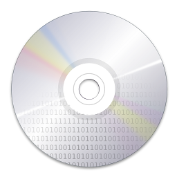
Wow!! You rock guys! This is the best app logo ever made :-)
I hope to see it frequently on my desktop.. now Akonadi code must really stand up to the expectations :D
The concept of Akonadi shown exactly, but actually, since it's not very advertised and doesn't really has it's real website and such kind of stuff - there's not many people to understand the whole deep of the technology and the idea itself. Well, great logo for T-Shirts, but it would be better if there would be many fans of Akonadi. Developers - yes, but hey, i can imagine a guy with Firefox or Amarok logo that can definitely say
- "I'm an Amarok/Firefox fan. It's the best Musik studio/Internet combiner i ever used!".
But what could i say if someone ask me:
- "Hey, nice orb! Whats that? Akonadi? So you're fan of..? Yeah, real geek!"
I'm not against to be a geek. And of course i realy adore the new Akonadi Logo. Just i see some kind of paradox here.
Well, nevermind, just 'Laute gedacht' =)
I would lose the banner (last image in this post) it contains to much graphic elements in the background. this logo would look even better in a minimalistic theme.
The most beautiful logo ever. Period.
And I do also like very much the duotone variants.
Great job Nuno!
Give credit where it's due. You two guys rock.
Working for this community is wonderful.
what is this for a font? it is great!
Keep up the great work! =D
Falls into work of art category, and top rated !
I also think it sends the right "vibe" for akonadi.
Yeah there is some similarities in the concept, but after a close look they are quite difrent.
And implementation wise this was not a 20 minute vector hack ;).
Ok ok im prety sure the mac ones were not a 20 minute thing :).
I think it would be really nice if when you do alt+f2 you exactly this:
http://davigno.oxygen-icons.org/i/runner-1.jpg
Then when you search something it slides down with the options like this:
http://plasma.kde.org/media/plasma_4_1_beta.png
Kinda like the effect in this site:
http://tryruby.hobix.com/
Other than that, I think the buttons needs some work, and it would be nice if the items have more margin, and more contrast.
Keep up the great work!
- kamal