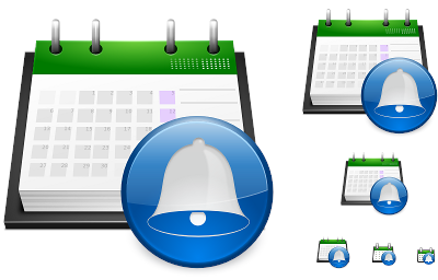
Korgac icon, new version.
The last version of the Korgac icon was not making most people happy for it had a Warning feeling to it, the "!" was not working dough it seamed like a good idea wen I was making it. The bell was the way to go, but I had some bad experiences making realistic bells in the past.
So the idea popped out in my head to make the bell in a more figurative way using the usual information signs we use in Oxygen icon set...
Btw I hope all of you have a very happy Easter, with lots and lots of chocolate
So the idea popped out in my head to make the bell in a more figurative way using the usual information signs we use in Oxygen icon set...

Btw I hope all of you have a very happy Easter, with lots and lots of chocolate


Comments
The rest of it looks great!
Great work, Nuno!
Thanks for all your hard work!
It's difficult to see, especially at smaller sizes.
- dannya