For the future.
In the past few days I have been working in so many different things I have a hard time keeping track of all of them, but all of them are moving in a reasonable pace, and its great seeing all the pieces falling in to place one by one.
One thing that as been bugging me for the longest time, is the fact that plasmoids need icons, and to be honest I was not to excited about doing icons for all of them, still I was not happy about the fact that they were hijacking oxygen icons and creating a visual mess were one would not know if that was the plasmoid or the application the icon belonged to.
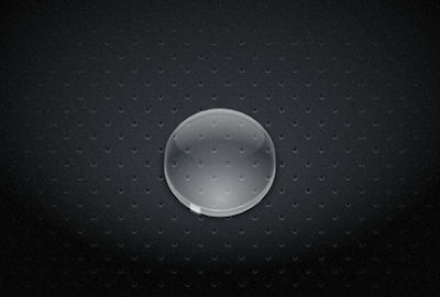
So we really needed to fix this issue.... today I think I found a possible answer, the basic idea is that all plasma apps (plasmoids) use the same base icon same shape, they can simply make one by placing an image under it and cropping it correctly. We could bend the rules a bit and in some cases place meaningful objects on top of it like a finger a arrow etc. but still keeping the basic shape. That way we will avoid confusion, make it easy for plasmoid developers to get an icon, and have a kick ass looking set of icons.
Well this is the basic idea, my first implementation of it

Its not finished and its just the basic shape still a long way to go, but think its really "clicable", witch is important for touch based devices were I see this little applications to have the brightest future..
Comments
I also don't think it is that important that all icons will have the same shape since you only see them when adding the plasmoid to a container.
So in fact the idea of a bubble seems to be a bit older now.;)
Same thing I thought when I read this post as well. :)
@Pinheiro:
I'm a little confused - is this only going to affect the icons in the "Add Widgets" dialog, or also icons in e.g. panels?
If it's the first, I'm not completely against it (not completely sure I like it either). The latter - no.
this is for launching proposes.
I do not like the idea, please do not change the icons
I would be okay with a more subtle background, or possibly an overlay like what is done for links or compressed files.
Also, feel free to prove me wrong, but I can't possibly imagine a distortion map looking good.
thanks..
aan
Thats exactly what I was searching in this time...
Thanks!!!
Thats exactly what I was searching in this time...
Thanks!!!