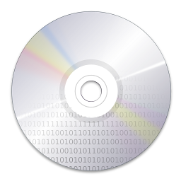
Making it an svg!
Vlad EOS wallpaper became default, one of the things that was keeping us down from doing that was moire problems we might have wen scaling it, but has we hade versions for every size in this world, it was only a mater of the selector in plasma getting the wright one, ruphy will take care of that.
the other problem was making it an svg..... so we could use it inside icons in order for people to relate the icons to desktop.
So today i decide to try to push inkscape to the limit, and so i did and in doing so i created this.
Had to remove the decorative lines in order to have no moire problems but i guess its pretty simple and similar to Vlad original work.the other problem was making it an svg..... so we could use it inside icons in order for people to relate the icons to desktop.
So today i decide to try to push inkscape to the limit, and so i did and in doing so i created this.

svgz Yes only 3.8 kb :) use latest inkscape compiled from source.


Comments
If you're interested in converting any other images to SVG that are bitmaps then you might want to try using this http://vectormagic.stanford.edu/ it was developed by stanford and does an incredible job. By the way you can reach me at rodneygomes@gmail.com (E claro que sou filho de portugueses ;)).
Rodney.
but no vectorization progran has ever captured gradients well. can only do it in several layers.
Just so that you have an idea this image has no more than 18 shapes and then it uses 2 masks and some blur filters.
congratulations
I was just happy couse I maneged similar efect just using vector graphics.
really a svg master!!!
You cold make a "kicker bar" that integrated well with this background and even try to make it move (using the svg mobilty ;-)
parabens!!!
how's Raptor anyway?
Do you think you could probably post a tutorial or a quick walkthrough of how you did this? I would love to be able to use InkScape that well!
Is the oxygen style complete now (KDE4RC1) or do you guys still work on it? The buttons and the overall impression i really like, clean and sharp, yet calm at the same time.
I'm asking because i see two elements falling short of the quality of your phantastic mocks... the menus are 0-8-15 you'd say in germany, meaning nothing special, even boring. Same goes for the progress bars i fear, they look clunky and nothing like the elegant and light bars hovering over the other elements with even a soft shadow in your mocks.
I want to express once more that i like oxygen as it is very much right now, i'm just missing this last "wow" i felt watching your concepts. Could i help, i'd be on your side right away, but unfortunately i'm more of a coder.
Your's
Marc
except in the fact the think that Nuno mostly needs is coders, so you must help
ehehe :D
Só para te deixar um abraço, pois já não sei se te lembras de mim, mas á algum tempo atrás passaste-me o bichinho do Linux e por cá fiquei.
Lembras-te de um melga que conheceste no DC++ :D
Abraço amigo
I was wondering if the tabs will look like it is now in RC1.. It was SOOOO very beautiful in the first version of Oxygen (Beta 1, the old version of Oxygen - With Colorful "background", like in "Option 1" in the Nuno's preview). That was one of the aspects that really showed me somenthing completely new and awesome! Please, please artists of KDE, consider bringing it back!!
Abraços Nuno, continue com seu trabalho incrível!
fantástico bestial agora tens de passar o bicho a outros tantos :P
@ashish bogawat
its realy simple, frist I do the shapes then i make a copie and place it under in black with a bit of blur.
them i make 2 copies of the wolle thing
thge i do 2 masks one witha radial increesing gradient that will be laid on top with multiply factor
the secong a nother mask that is stonger on the sides that I blurto give the out of focus effect .... just that :)
Sorry I'm probably asking too many questions, but not being able to do this is driving me crazy. :-)
hee its the original masked object that gets blured not the mask itself :)
I know you aren't the developer, but why in the world Oxygen theme looks like a crap (it's not a crap, it's actually somehow nice) at the side of your mockups?
I know that their may be some limits, but, even GNOME themes can make windows gradient, same whit the Old Oxygen style (now Bespin).
The key of your vision of Oxygen was exactly that, Windows that have a gradient all over it, and in your mockups there is contrast, in the actual Oxygen theme, whit all the contrast set (and this happen even whit dark themes) it looks plain.
I love your work, but the actual theme (coder mistake, not yours of course) it's far far far from your mockups.
See you, and cheers to all Oxygen Team Members.
i ve opened this svgz file of yours in inscape and redering of image is so very slow. Is it just inkscape thing or is my computer slow since i have northwood 2,5ghz?