Air and KDE 4.3.
Air was the wallpaper we introduced in KDE 4.2, but that is just the beginning of something larger. Air is supposed to be different than what Oxygen is, something that tries to appeal to a user base looking for a more "sexy" experience than Oxygen (yeah I know you are out there :) ), but to still have the capability of merging nicely with what we have now. The first thing we started working on was a Plasma theme. Plasma, with it's immense plasticity and a fantastic coder team, allows us to try to push for new ideas. Another extremely cool thing about Plasma is it's ability to become anything you want it to be. So a user in KDE 4.3 might have a desktop that looks like this, if that is his wish, without having to use external software: (click for fullscreen mode) This is an example of how simple one can make a desktop in the 4.3 Plasma once we all manage to get all of our plans working. The new systray speck will help, the work being done on the task bar will allow you ...


Comments
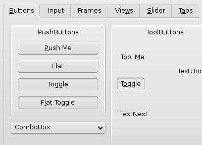
The text on the tabs and on the combobox are positioned quite a bit too high. For example.
Peter
Having said that, in this example it would clearly be the first version, because it has higher contrast... although, not much...
Michael
Michael
The 'extra space' that this produces is nice for a small border around icons, so they look less easily stuffed against the edges.
-- sebas
OS X has the aqua style; Vista has the rounded&transparent window corners and the cool buttons in the top-right-corner.
KDE 4 must come up with something sexy!
KDE 4 will have Oxygen.
I'm also for the 1px version. The other one looks a bit "fluffy" to my eyes.
Unfortunately, the actual code doesn't look nearly as slick -though it's slowly getting there-. The style in Beta 4 looks like a bunch of distressing patches of white flashing at your eyes.
The thing is, I was *totally* unable to make out the window outlines when stacked on top of other windows. For instance, when attempting to move a dialog around, I would find myself dragging the larger window immediately below. I just *could not see* the dialog!
Agreed, the shadows and bling effects give windows some depth and makes the task easier, but we cannot rely on bling for such elementary visual hints as telling where windows end. Also, I presume shadows, background window darkening, etc., won't be available on lower-end hardware (such as my very dear 4 year-old Thinkpad).
That's not to mention visually impaired people. Aren't we paying attention to usability laws in that regard? (hint: it is a requirement for Government acceptance here, in Spain).
So, folks, bear with me: WE NEED MORE CONTRAST!
I want to believe. I know you are listening.
the difference between them was a single numeric constant.
I just committed the thinner version as most of you, plus me and pinheiro, chose.
may eventually be configurable but first we'll see if we can make a really good default that everyone likes...
the contrast thing is a simple matter of choosing a darker default background color, which in KDE4 is as easy as it was in KDE3's kcontrol. pinheiro will do this eventually, he's doing a shitload of icon work in the meantime that none of you are seeing cause it only happens in SVN.
oh and anyone for whom the Oxygen of today is not looking unique enough, post mockups or quit whining
I would prefer having both and being able to configure it in the configuration dialog.
nathanael
I knew you were listening ;).
to all of you asking to stop the mockups and work on the code, well guess what, the pics in this post are *screenshots* :/
Well, I take your word for that. Gotta try the freshest SVN code, but either way, I'm a bit concerned that if rendering differences are so striking accross different video cards/displays/drivers/whatever, we might have missed something important at the base of the Oxygen design.
I'll try to post a screenshot later. I hope you'll be able to see the difference with your own eyes.
the contrast thing is a simple matter of choosing a darker default background color
I'm not talking about widget vs. window background contrast here, but foreground windows vs. background window contrast. I don't know if that can be changed in the pref's pane -I haven't played much with the newest beta-, and I know that poor overworked Nuno will get to making it the default, eventually. I just wonder whether we might be a bit lost in the forest, as we are discussing the "1px" vs. "2px" thing when there are such clearly outstanding usability issues.
oh and anyone for whom the Oxygen of today is not looking unique enough, post mockups or quit whining
Amen to that, man!
Please, don't take my comments as put-downs - They aren't. I'm most impressed with the work that you guys are doing and by all means encourage you to carry on that direction. I wish I had better coding skills, or that I had some spare time to work on a couple of mockups to share with you, but hey, moaning is the easyest!
And I was impressed of the new colour configuration, finally changing the contrast makes a difference.
Also like the new colour schemes in svn. (especially BeOS, but the other are interesting as well).
The default colour scheme with the green and orange highlights is beautiful!
@ tecnocratus
Some time ago there was something that changed the colour of the whole inactive window and its content.
It was not very pretty and was removed.
But I think it is worked on. (I see a configure dialog already in the colour config, but it does nothing)
Ou melhor... a primeira, é mais limpa.
É sempre bom ver um português a fazer coisas realmente giras. Parabéns! ;)
I have to agree. When I look at some screenshots, it is very difficult to tell windows apart, when stacked or overlapping each other. The numerous complaints about "lack of contrast" are probably mostly complaints regarding difficulty to distinguish foreground vs. background windows. This should be addressed.
BTW, the 1 px outline looks better to me... and I think you guys are doing a great job!
I feel that it is one of the best things to happen to linux in a long time. The reason why i switched from kde to gnome was because KDE just didn't look as good, but that is changing quickly, and i am looking forward to KDE 4 when it is released.
The icons are beautiful, they are much nicer than the crystal icons (and more professional). So far i have tried Beta 3 and Beta 4, and as soon as i can i will be trying the next release, and i will hopefully be switching from gnome to KDE 4 when it is released.
I've been following KDE 4 almost since the beginning when I first read about it...all of my friends are getting tired of me blabbing about it.
Good work guys! Innovation for the win.
Is the same for me, I was trying kde4 beta4 the other day and it looks amazing, but when I have two windows overlapping is realley hard to tell where one ends and the other starts.
About the post, I prefer the first version, althoug both look beatiful.
Everywhere else 1px is great. I love the crisp feel. It makes me feel its sharp, light and less bulky