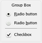
Oxygen style shaping up.

Today Matthew Woehlke made the radio buttons look like this.....
Evidently I'm extremely happy more work being done in more areas of the style like the check boxes.
Tomorrow we hope to have the final list of wallpapers done, so Sunday we can unveil the big winners.
DIGG
Evidently I'm extremely happy more work being done in more areas of the style like the check boxes.
Tomorrow we hope to have the final list of wallpapers done, so Sunday we can unveil the big winners.
DIGG


Comments
Nice job.
But it has too less contrast.
Especially on LCD displays that have more than a year.
This technology is not quite good when it comes to contrasts. But most people use it. So visual themes for modern desktops should take that into account.
Btw, where are the Oxygen icons located nowadays in KDE's SVN? They seem to have been moved from kdelibs/pics.
P.S. É bom ver um compatriota tão envolvido num projecto como este!
But keep up the good work!
While I'm at it, does KDE4 still respects color customization, via "Control Center > Appearance & Themes > Color"? Because I actually do use those settings sometimes.
the colors should work, at least in the final version, don't worry.
the colors all over the place (green, orange) are cool... Though I did remember they where for testing?!?
the main reson im posting this is couse the radio butons have just been vastly improved in that department, also another part of the problem is the curent color sckeam, but that is easyly fixable and i want to do that in the end testing against several not so good TFT screens.
How hard is it to write WinDeco themes in KDE4? There was something called Cokoon mentioned in the July KDE Commit-Digest; what is that?
Boudewijn
More contrast please.
The mocks actuly i shown them from time to time but i wish people would not spread them arround has they are the desired look but they have still to be coded into a theme and a theme is not an svg so there is no guarenty it will look like that or heven work at all....
People get extremely exyted about this stuf and some times treat the people giving theyr best work and time in the worst maner.
Normaly we are kite resposive IMO in IRC about coments or feedback, but this is a WIP so not all is done and most looks like .... well you know ;)
http://img504.imageshack.us/img504/1743/picture1uq9.png
you might also want to look at those links for some inspiration ;)
http://macnewsonline.com/wp/2007/07/09/5-leopard-gui-gripes/
http://blog.turbomilk.com/archives/000164.html
http://www.thinkmac.co.uk/blog/2007/08/hint-how-to-redesign-leopard-dock-so-it.html
http://watchingapple.com/2007/06/apples-gravity-lessons-learning-from-warner-bros/
http://img213.imageshack.us/img213/3170/picture3vy7.png
keep up the great work!
I go days without sleeping and instead of being thankfull for the hardwork, they nit pick at first draft work. Because of this, I have kept my mouth shut about Oxygen and KDE4. I don't think what I have seen so far is perfect, but I do 100% sympathize with "works in progress" and I trust KDE 100%.
My issue is that the minimise/maximise/close buttons in the top right corner of the window are just blank buttons (see http://arstechnica.com/journals/linux.media/kde4-beta2.png). To find out what they do, you need to move the cursor over the first button, wait for the icon (e.g. minimise) to appear on the button, move to the second button etc. It doesn't have good "affordability", a usability term meaning "you can tell what it does by looking at it". This is a very important factor for user friendliness and makes work more intuitive as you can take a quick glance, see what something does and get on with it instead of hunting for what you need. I can't see any advantage to these blank buttons except reduced clutter but I feel the reduced affordability is not worth it.
For instance, you can't say to someone "click the cross in the corner to close the window", a new user can't just look for the close button and find it because they have to search for it first etc. I realise most people have it ingrained into them which button is which, but for new KDE users and novices, clicking the wrong button (e.g. close instead of minimise!) is not a nice mistake to make.
I do like the new oxygen style (good work!) but it needs a little more work with colour/contrast/icons to help users find what they're looking for.
You didn't keep your word ;-)
Angry birds clone| Fiverr clone script| airbnb clone|