Posts

Showing posts from 2010

The magic that we do :)

Image
We do icon themes, we do Qt themes, plasma themes, sound themes, cursor themes, color themes, website themes, we do themes for KDE, so what themes might be missing for the KDE user????? Hum.... what about, GTK themes..... yes I know you use GTK apps in KDE, I do...., so and because its Xmas time and all and, "santa" HUGO is so nice, we give you OXYGEN-GTK have fun :)

33 years old!

Image
Today I am turning 33. Its one of those classical ages, were you have to think about what you have done so far and what you are going to do next. So what did I do so far?..... nothing much except having a lot of fun, for example today I managed to get the 32x32 icons below 200, 198 to go :) And this points me to what I'm going to do next, yes 198 icons :) Hope I can keep having fun with KDE, and make it fun for you to use it as well, .....

Its the end of the world, and KDE!

Image
So KDE is coming to an end :). I think they got it all wrong, what was finally finished was the 48x48 mimetypes not KDE. So today I started to kill KDE a bit more :) 32x32 :) enjoy! Only 227 icons to do in this size :)

We have work for you!

Image
So first things first, last post i mentioned something about 48x48 icons and a promise is a promise..... Ok as I said in last post the improvements to small sizes should be less visible, still as you can see in the side image they are real.... Its all about Elegance (yesterday I could not remember the blasted word ,sorry Gamaral), elegance is accomplished in the details, we are still very far away from a truly elegant icon set but we are getting closer :). As you can see its really small details that make the difference, but then again it is in those small details that may reside the differentiation of what we do and what every one else is doing... There is one problem though, this is a lot of work, and by alot I want to say something like 2-8 hours each day for the past month or so and I'm still in the middle of it... Have I mentioned that there is about 1200 icons still to do ? Had that to all of the other KDE works, and I have a problem.... I need help :) I'm completely awa

Bye bye 64 hello 48.

Image
The size 64x64 took me more time that what I was originally expecting, not because they were particularly complex to make but simply because I was to busy with other more important KDE related things, with a new release of our desktop in its 4.6 incarnation coming out, we get extra amounts of work to do, plus given the relative success of the oxygen project all projects want to look good and request our assistance, so I end up juggling a lot of subprojects at the same time. I'm not complaining or anything, its great, and very different from the way things used to be not so long ago, think this change is probably the greatest accomplishment of the oxygen project. But getting back to the subject of this post, yes 240 icons later the size 64x64 is done and next (now) we will move on to size 48x48., so i think I'm still on time for 4.6. They look much better than they did IMO but the improvement for the sizes 16x16 22x22 32x32 will be less pronounceable as the ones we had were ma

This post's are getting boring no?

Image
I come here I do a "dent" like post were I show something I have done, and the progress of the work, get some feedback, and we move on.... So in order to not brake the cycle I'm forced to show a couple of icons, here they are :) Then I will make some comments on them like "this are 64x64 icons" Dohhh :) Next I will say something like .... "made 95 of this icons". And in the end leave a positive remark about the future "tomorrow I hope to do 50 more". This would conclude my post. I'm booooooring :D. P.S. Its great fun to do the work and show its progress here, but I noticed that my last posts were kinda similar, sorry about that.... We are working on many different things for the 4.6 release. And I'm confident it will be our best one ever. P.S.2 see I have done it again, ending the post with a positive line about the future. I'm really boring. :D take care

Just like before!

Image
Just like some days ago, I finished another set of mime-types now in size 128x128, and have already started with the 64x64 size, as you could see in the previous post... so 240 icons done 240 icons to go :) I'm sure there are all sorts of little and big errors in them and wen I'm done with the lot I will try to fix them.. Have fun!

Someone asked?

Image
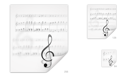
"Anonymous said... 6:00 PM I’m not sure whether this is the right place for this, but may I request a mimetype icon for Lilypond? It’s a music sheet engraving program very similar to LaTeX (www.lilypond.org)." Well no, its not the best place to ask for icons, the best place would be in oxygen's SVN playground were we keep a series of lists of required icons. But in this case and since the icon was already made I decided to show what we had done to it :) Hope you like it (I know I liked it since it was the first time I did decorative typography) I'm not unhappy how the clave looks .... 128x128 is a bit cluttered.... but well "this" icon thing is fastly becoming the art of what we can do in less time possible to as many icons you can . With time it will get better. :) PS the over contrast is a result of a quick montage in inkscape that resulted in sup pixel problems that I solved in gimp but ended up looking to sharp the real ones in svn look better...

A couple of days!

Image
A couple of days, well the last 2 at least I think have been the most productive of my life, yesterday I committed way over 100 128x128 mimetipes in to svn (only 75 missing) , also today I mostly finished a concept for a KDE website, and I am now working in kolab.org refreshed identity, that I think as some good potential.... we will see.... as usual the snapshot of yesterdays work... Crazy as it may be, I love it, KDE is a product of LOVE, the love of many many crazy wonderful people. And thankfully there are a couple of days wen everything just works (TM) . Have fun!

Done with 256 hey 128.

Image
Today I mostly finished the 256x256 versions of the mime-types, and already started with the 128x128... only 161 to go meaning that today I made (scaled) about 80 icons, a complete record for me.

Only 32 to go :)

Image
Small update on the status of the new mime-types I'm getting ready for the 4.6 release of Oxygen icon set for KDE. As you can see we have some additions to our collection like the Qt-quick qml mime-type, or the color profiles one. Only 32 are missing now :D

As long as the last, but better.

Image
Just another small post to show progress on the new mimetypes for the KDE 4.6 :). I have done about 150 in the 256x256 size and there is about 87 to go.... My original idea was just to update the "paper" but ended up doing a bit more. Hope you like the result.

A small long post.

Image
The last few days i decided to start refreshing the mime types of oxygen... started with the large ones that were looking really old by now. I hope you guys like them, I'm only half way there :)

4.5 is free!

Image
KDE is a lot of things, today we give you new versions of the KDE Development Platform, the Plasma Desktop and Netbook workspaces, today we give you 4.5.0. There are as usual many small, and big improvements that you can read on www.kde.org . I feel honoured to be a small part of it. Its wonderful to see that, the efforts we engaged few years back are starting to pay off, that Artwork and Branding cooperation with the distros is really shaping up, special kudos to OpenSuse, Kubuntu, Mandriva, and many countless other distros like Caixa Mágica , for sharing the work, cooperating and becoming part of KDE. I would like to send a special thanks to the people at Mandriva, ( neoclust , and mikala rock!) for providing-me and others, with constant builds of the most recent KDE in trunk that I could test and work on, there are many ways we can work together and help each other mutually, this is one of them, thank you :), grab your build now from one of your kde mirrors .

KDE Pim Mobile

Image
So for the last months we have been working really hard to, port our great PIM software to the mobile world, and I must say it is a challenge, the rules all change and most of what you know does not fit the specificities of the interaction methods, the size and dpi of the screens, or even how something as simple as a gradient does not work as you expect. Had that, to learning new exiting technologies like QML and starting to do working mock-ups with them that developers can interpret much better, and in some cases implement directly. (ok this was only a problem for me, but hey if I can do it any one can :) ) And wen you try do a no compromise, solution for the software, meaning that no major feature is removed, you find your self with a monumental challenge. The good part is that so far we managed to overcome all major problems with what I believe in some cases are really innovative, new interaction paradigms, example the folder selection method we created. Also good is that we now are

Akademy 2010

Image
It as passed a long time since I last blogged, but the reason for this is the best reason of them all... I really cant find the time for blogging as I'am very busy with all the fun stuf we been working on. As a kind of resume. 1. KDEmobile PIM work is great, the applications are really shaping up and its fun to work with such brilliant people. 2. Oxygen work as done yet more fundamental steps into provide a immersive and polished experience to the end user. (tons of bug-fixes in oxygen and a lot of pixel polishing gives me the confidence to say this is the best oxygen ever) 3. Preparing a lightning talk with my old great friend David, about some really easy and simple tips about UI design, and how to make applications a more fun experience to the end user. Also we will do a BOF were we hope to do some real app's Ui's improvements (every one is invited) 4. Helping the KDE e.v. foundation along with Eugene (Eugene did most of the work :) ) in the great join the game. It

I'm going

Image
This Friday I should be going to the Oxygen meeting #3 it is a joint event betwin, Kwin Plasma and Oxygen a sort of "all your rotten eggs in one big big basket" :). Personally I think this is one of the most important meetings for Oxygen. As i think that oxygen in 4.5 will reach maturity on the set of goals we decided a few years ago (5?). Oxygen set up to be a great number of things in what could be considered a silly over ambitious project. That would be... A complete icon theme for KDE and the KDE ecosystem. ( we ended up doing a bit more than this) A windeco theme. (that blended in perfectly with the window itself) A qt theme that would blend in, and was coherent, yet innovative in a classical non obstructive way, that was fully animated not because we could but because it creates a more polished experience with more intuitive and natural flow of information. A cursor theme. A sound theme. A plasma theme that should never be confused with the qt theme but yet retain the

It is done!

Image
KDE s.c. 4.4 is out of the door, I think its by far the most polished version of the KDE desktop we have released, plasma is looking very nice, there are lots of new features and one can feel more integration between all the pillars of KDE. But what I'm truly happy with is with our little baby, Oxygen. Specially the kwin decoration and the qt theme, we have jump in terms of end user experience by at least one order of magnitude, almost all elements have animations that are unobstructive to the user, a HUGE number of bugs have been closed, I was trying to remember all the improvements we introduced in this release of oxygen and I lost count, honestly have no idea, its more than 50 of that I'm sure. In the next few days, and because i know some people like to have more options we will share with you guys ways to extend the number of options in oxygen theming and animations ;). Oxygen icon theme goes on as usual we now have over 5000 files that cover something like 1300 differen

A bit more contrast and the smaler versions.

Image
So flowing the feedback from yesterdays blog post here is an update on the status of the icon. Did not made the arrow green or blue for several reasons, most of them that have to so with the over usage of arrows and the fact that the green one already have a more document local browsing meaning to them. Plus I think that this one that pop up from the envelop itself makes sense to me at least, and avoid hading unnecessary visual clutter. One thing don't judge a icon contrast by the way it looks on white background specially if this contrast is made with alpha shadow, the white tends to fade it off. The same icon on actual oxygen use... Might still play with the 22x22 version a tad bit but overall I am happy with it... For 16x16 there is a option to just use the arrow like we do in many mail icons, we could just use the tiny arrow that is the defining element. Maybe....

Time for fixing :D

Image
Today Björn Balazs published the results from the last survey an the results point out that I should do a new "send mail" icon , the old one was very nice IMO it avoided the use of an arrow , that we end up using in action icons way more that I would like to. But against facts there is no possible argumentation. :) So I think this might work a bit bett er . So, better? worse ??? What do you think? I would like to avoid mailboxes and stuff like that as they scale pretty badly. # P.S. in the last days I have been working on encrypt document, sign, and lock, type of icons (as you can see in my identi.ca thingy ) and probably the icons in Kmail that deal with that issue will be a bit restyled mostly encryption that right now uses the same metaphor that "lock" does and causes some confusion.

A very small post!

Image
So KDE S.C. 4.4 is almost out there, and we in oxygen are very happy with our work, there is a lot of polishement in it and we think the its one step closer to what we hope to be a complete experience. The drawback of it is that "busy" is the word we most pronounce in a day to day basis, and it as been undermining my attempts to blog or even to make more icons for oxygen.... Still here is a couple of icons made in the last days, it is mostly koffice icons. Oooo and Happy new year :)