Posts

Something fresh something new!

Image
Don't you love the concept of starting something new out of the ashes of something old? To restart, to fix what was wrong, to potentially do it perfectly this time, to fail all over again, so that you might in the future start something fresh something new. More info at  http://wheeldesign.blogspot.com/2014/01/the-visual-design-group-short-intro.html 

In the beginning there was a screen.

Image
This is where desktops, exist. and its a part of my "back to basics" series to take a look at our traditional desktop, up there 256x256, 128x128, and 64x64 icon versions of a more modern screen in the same style as the laptop , and just like the laptop works in bigger sizes... So probably you will see it used in other situations than just the icon use...  

Back to our basic desktop icon-s.

Image
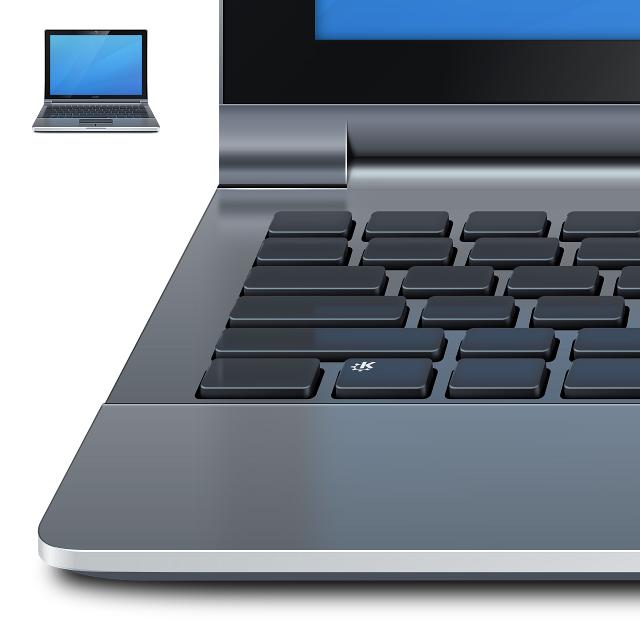
This weekend I spent most of the time playing with one icon that will be really useful to present our desktop line of products... A laptop (ultrabook kinda)... I ended up overdoing it a little bit to the point were it only made sense to look at it in 2048x2048 pixels :) so hardly an icon, and that wasn't the point, the point was to make an illustration of a desirable product that could show our KDE main Desktop. The fact that We can use it as a device icon is just a fortunate coincidence ;). Its still filed with multiple glitches (like the keys a bit  "off", or overdone contrasts) but I think it will do its joob, as will the TFT screen I plan on doing next week. Cheers and keep on having fun. PS (the icon versions will show as usual modified and simplified version of this illustration so it remains easy to recognize and not a smear of pixels, you can already see that in the 128x128 version up there)

Back to our basic desktop.

Image
In the last weeks I been spending more than a fair bit of time working on what I consider the basic desktop, you know what we usually know as KDE that will be reincarnated soon in 4.10... The focus so far as been mostly in decluttering most of the visual junk that had no  functionality, In a way making our KDE more simple without making it more "dumb". So far I'm happy with a new wallpaper still a W.I.P. (I for some reason hallways need to start with a new wallpaper canvas.) Me and Marco Martin moved into clean air a "bit" and I'm really happy with the progress so far. We are also trying to improve some fundamental aspect of oxygen windeco in correlation with how apps can use it, for example letting apps use some features of  oxygen automaticly. The test app for this as been decided to be Gwenview. And if all goes well we get this on kde 4.10..... Sooooo, I start to look at the app this week end and I notice that the Background is a solid dull ...

Back to basics

Image
What you see up there is a icon for a new KDE App Picmi, a kinda sudoku like game but more fun.. It's still a work in progress but I think its looking nice and retaining that level of fun that games like this have... It was to me a bit of retro gaming style so I opted to bend traditional oxygen icon style a bit to fit what the game was all about. And that served as a great excuse to talk about some of my personal plans for 4.10.... No mater what some people might say I don't think the Linux desktop is dead, I mean my KDE is  working wonderfully here, fits my needs as a work desktop that I mostly interact with with a keyboard and a mouse. So for 4.10 I plan to work on that basic experience people know as the KDE desktop, you know the plasma-desktop shell, the oxygen theme a new wallpaper and a few more things I find time to do.  That reminds me, do you have design skills? Do you want to work on something brilliant? Want to help define the desktop millions use? ...

Time for a pause

Image
Call pause icon.... I'm biased in relation to this set as I think its overly detailed with to many features... there are many many missing, but its a WIP. The idea here is mostly to try to use context, so this icons will only work if they are some how grouped or shown in a given context in this case a telephonic context. (so in the call-pause icon I dispense the use of the phone speaker visual element and trust the context.) Its a good example of some of the problems we end up with with generic icons sets were we need to repeat visual elements as we don't have control over the context, this end up creating overly cluttered with information icons, and worse they look stupid as they repeat the same information over and over again. Problems with looking stupid is that in a way we are calling our users stupid repeating the same message over and over again. This type of analysis is something I have been doing a lot lately, I believe that the way we tell the story of our ...

The litle guys are icons 2

Image
So to complete my  Bug 252729 killing the little guys Cheers... A new one tomorrow.