A very small post!
So KDE S.C. 4.4 is almost out there, and we in oxygen are very happy with our work, there is a lot of polishement in it and we think the its one step closer to what we hope to be a complete experience.
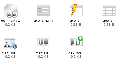
The drawback of it is that "busy" is the word we most pronounce in a day to day basis, and it as been undermining my attempts to blog or even to make more icons for oxygen.... Still here is a couple of icons made in the last days, it is mostly koffice icons.
The drawback of it is that "busy" is the word we most pronounce in a day to day basis, and it as been undermining my attempts to blog or even to make more icons for oxygen.... Still here is a couple of icons made in the last days, it is mostly koffice icons.
 Oooo and Happy new year :)


Comments
+ one good looks hint, wen making icons if you can avoid the use of more than 2 elements then you are wining, 3 elements make th icon mostly unscalable, and had clutter.
Thanks for your comment.
Thats exactly what I was searching in this time...
Thanks!!!