The red Bell
One thing I realized from my last post is that Oxygen does in fact use less red than blue :).
Well the fact that red is a color associated with mandatory rules and warnings might have something to do with it, so that means that red is probably not the best color for lets say...... a mouse. Btw after all the comments i got i will try to make a mouse in the other position that is with the buttons facing up and improve the contrast of white.
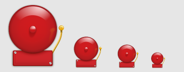 David sugested to me the other day that i worked the bell icon a bit (the curent one looks like a UFO in small sizes). One thing lead to another, warning, bell puff red bell!
So what do you guys think?
(BTW 22x22px and 16x16px still neads to be done).


Comments
I suffer from mild colourblindness, and while I have no trouble seeing the red of the bell, lighter shades can appear to me as white, not to mention that red is a colour that my eyes seem to glide over and miss much more easily.
This is an all red icon so i gess its not very problematic.
Thanks for listening about the mouse!
Also, the yellow part lacks contrast on non-white background like the gray you've used.
Thanks!
2. Simplify -- make the red bell a simple smooth dome lose the bubble in the center
3. Simplify -- lose the red rectangle, cause the hammer to issue directly from beneath the round bell
@gustavo has i said they are only the big versions.
But some extra work might be needed in the 32x32.
>> not to mention that red is a colour that my eyes seem to glide over and miss much more easily.
Aren't red and yellow supposed to be the colors that attract the eye the most?
Also, I agree that the rectangle base should have another color.
Maybe the hammer should be bigger ?
Maybe I'm not used to his kind of color for a bell :) (more used to this http://www.healthcare.uiowa.edu/cdd/Images/bell%20icon.gif)
Maybe I'm too used to think a bell looks like this : http://www.esd112.org/courses/assets/taplarge.gif
Maybe this comment contains to much maybes ?
http://websvn.kde.org/*checkout*/trunk/playground/artwork/Oxygen/Pinheiro/bell.svg?revision=626698
Now if you can actually pull the above effect of in an icon... well I couldn't pull off even something as 'simple' as your version, so I'm not about to make any demands.
I think it is a little too red - but then I'm slightly colorblind, so that might be just the way I see it.
i will fix the hamer a bit to improve his visability aiming at 48x48 and 32x32 and maybe that will fix it for 22x22.
I think the bell itself is beautiful. But the rectangle below it is not so nice. It's not realistic enough, it seems too 2D. It lacks weight. I ask myself -- how is the bell actually connected to its basis? The screws are OK because they add to the realism but they need to be symmetrical.
I hope this would be useful. You do great work.