A clock in mid Air!!

So the last few days I haven't been able to do any real icon work because i have been busy with real life work , and prepping the artwork for the 4.3 release. That mens playing with plasma stuff and helping Marco Martin do his magic... So we reworked the plasma air theme so its more air theme and less oxygen... they go anlong very nicly together but they should not use the same elements :).

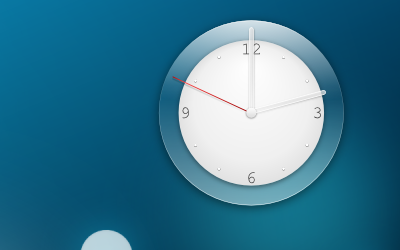
Marco is working on the really not so fun part of the task bar and panel, were me I got the clock part :) aka "the easy one" :).

Here you have a mock svg (final thing should be almost exactly the same ). a close up of the clock "in mid air" :)

Comments

Podstavsky said…
Very nice analog :) But in my humble opinion this clock need just more frost effect.

However - enormous style!

Best wishes, Podstavsky.
Anonymous said…
Gorgeous!
Anonymous said…
On the first screenshot, the clock is not very clear (white on white). I don't know if it's because the screenshot has a small size, and if it's better in real life situation, but maybe it could be a problem.

Otherwise, very good (and promising for 4.3) job :)
Anonymous said…
Ok, forget what I said, I just saw the screenshot in full size. It's very nice and clear in fact :)
Tomasz Dudzik said…
Imho the clock from your first air mockup was the best. This one needs more love, but i like it too :)
Pinheiro said…
@Tomasz Dudzik i tried several more avantgard designs we could do but i commed to my sences and realized that a clock must still resemble a clock, there is also more pargmatican questions that camed into place....
Augusto Leite said…
Just loved this clock...

I have just seen some of these changes on the theme on trunk now... It is very beautiful indeed.

Keep up the excellent work...
Anonymous said…
The best clock ever ;) Thank you.
Mazur said…
I don't like it at all. It makes Air looks stupid =S.
Anonymous said…
WOW. The panel and tasks look greet to! Thanks ;)
Anonymous said…
I like this panel.

The button shapes and curves are much more reminiscent of the Oxygen style itself. Matches very well, aesthetically.
Anonymous said…
One minor point though:

Blue highlights on blue are not effective at all.

That is the only consistent problem I have seen. Light blue on light blue is obviously invisible, whether it's used for a button highlight or a window shadow.
Ricard Marxer said…
My taste tells me there is too much white, and the Airy (translucid) border of the clock is too thick.

It kind of sticks out too much of the rest of the Air style.

That said, I really like your designs even this one, maybe it would fit better with another style.

keep it up nuno, it's always fantastic to see a post of you in the planet...
Anonymous said…
very nice taskbar and clock - can't wait for 4.3 :-)
Pinheiro said…
@Ricard Marxer scalability of the clock is not like the one in the plasmoids, here the thikness of the border scales as well, so the perfect thinkness is a mater of how big it is...
Pinheiro said…
@Anonymous trasparent themes couse all sorts of problems, that the reason we will continue to work on oxygen theme that is a more "all grounds woks well in any place" theme air is more a summer prespective on kde that weill work well in most places but can have some issues with some wallpaers...
Anonymous said…
Very nice! Thank you!
Angel Blue01 said…
I'm stuck without desktop effects, how will this look without compositing?
Chani said…
can you make the clock hands more visible? I find them hard to see on many of the pretty themes.
Pinheiro said…
@Angel Blue01 the clock exactly the same,,, the pannel and (on top kwin) plasmoids white
Alvin said…
I love the clock. Thanks, Nuno.
Looks like 4.3 will rock hard.

Btw, can we now place plasmoid inside the system tray as in the screenshot?
Pinheiro said…
@Alvin think you already do, not sure there is a ui for it dough...
Anonymous said…
are this updates availables in the SVN??

sorry if forget this comment: "looks like vista/seven/osX/gnome4/BT" /ironic
Anonymous said…
wud be good if make the needles color non white since the center body background is already white..
Dread Knight said…
OMFG This is awesome!
Dread Knight said…
I'm almost tempted to use the first screenie as my wallpaper, can't get my eyes off of it. And I'm really not that much into glossy stuff usually.
Anonymous said…
YOU ARE FULL OF SURPRISES....
i was wandering what could be better design for the clock than the current one....
this is amazing....
great work....!!!
Anonymous said…
the original clock of the first screenshot of air plasma theme was more beatiful...i hope it's that clock in final release of air theme..
Anonymous said…
The hour and minutes pointers have the same size, it is hard to tell the time like that.

What about the other more dock like taskbar? is it going to be included in 4.3?
Rezza said…
How does it look without translucency - eg. as desktop effects don't work on most computers I'm working with.
Fri13 said…
All looks great but the clock hour and minute hands are just too similar to each other.

Even that I watched the screenshot in fullsize 10 seconds I got few hesitates about the hour hand is top and not on right.

I think hour hand needs some polishing.

I believe that the analog clock should be designed such manner you can just place it to your screen about 3-4 cm size and still recognize the time when looking it 2-3 meter away. If it is needed to scale bigger than that just to see time when you are near computer, it loose its meaning :-(
Storytots said…
Traditionally, the hands of clocks are of substationally different lengths to enable them to be distinguished without callipers.
johndrinkwater said…
That’s great!
Do agree with others that the clock hands near to be more dissimilar
Unknown said…
looks Perfect to me.
yman said…
The hour hands are not so visible and are too similar to each other.
Domker_ said…
Great Air theme!
Pointer of hours are a bit too long and panel recalls the Windows 7 panel. (characterized by a dark line with white underneath)
Anonymous said…
I'd just like to add another vote for a shorter hour hand. Apart from that, it's great. Keep up the good work!
Anonymous said…
right
Aubreigo said…
"i tried several more avantgard designs we could do but i commed to my sences and realized that a clock must still resemble a clock"

Why not do both?

Popular posts from this blog

Design done...

The air we see...

Do you like code? do you like art? Do you love KDE?